Awwwards Article:
Frame work:
-standardized set of concepts, practices, and criteria for dealing with a common type pf problem
OR
- a package made of of a structure of files and folders of standardized code (HTML, CSS, JS documents, etc.) which can be used to support the development of websites, as a basis to start building a site
- most websites share a very similar structure, which allows developers to cut out most of the work of starting from scratch, and save alot of time (pre-prepared standard kit from which to work)
Different Types/Layers of Framework:

Front-end Frameworks:
- usually consist of a package made up of a structure of files and folders of standardized code (HTML, CSS, JS documents, etc.)
Components:
- CSS source code to create grid
- Typography style definitions for HTML elements
- solutions for cases of browser incompatibility so the site displays correctly in all browsers
- creation of standards CSS classes which can be used to style advanced components of the user interface
Simple vs. Complete Frameworks
Class Exercise:
We had a bit of difficulty with our class exercise, especially with creating the responsive columns. we could create the columns, but they were not responsive. All that would happen is the text would be fluid and squish together to where there would only be two or three words per column. After having it reviewed, the problem was fixed but we still didn't understand what determined when the three columns were supposed to stack on top of each other in mobile mode. Also, I think that they should go to two columns in tablet mode since they seem a little long, and then to a single column in mobile.

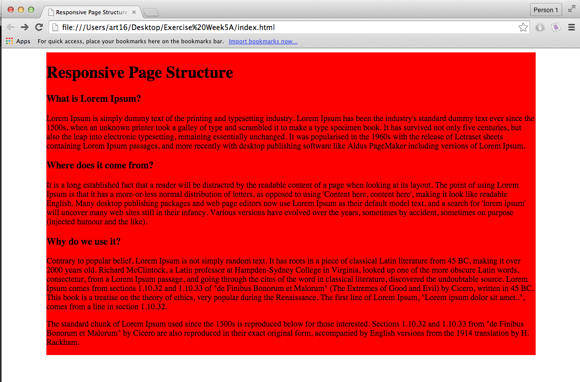
These are with the adjusted code, but we are still confused as to where the media query is that determines when the columns adjust their size.


No comments:
Post a Comment