Monday, February 23, 2015

Week 5: Outside of Class

This Weekend outside of class, I worked on the rough wireframe layout of my website to pretty much pinpoint where different elements go. I was a bit confused at first with making everything work, especially the two images on top of the home page. I would like them to each take up 50% of the screen on either side and fill the whole window, and depending on which side you click on is the side that the content changes to as you scroll down the page. While I was working on this, I revisited one of the websites that I included in my style board because of its vertical split imagery, called Carel + Piet Hein, and discovered that they have a one page website, which is almost exactly how I would like my Farm Show website to be laid out. I would rather this layout than a parallax scroll. Ideally this is a similar setup which is much more simpler in terms of layout, but unfortunately more complicated in terms of coding and functionality.


Wednesday, February 18, 2015

Week 5B: Feb. 18

Today in class, we broke into groups, read an article on Awwwards and worked on a live test page version of a Responsive page structure.

Awwwards Article:

Frame work:
-standardized set of concepts, practices, and criteria for dealing with a common type pf problem
OR
- a package made of of a structure of files and folders of standardized code (HTML, CSS, JS documents, etc.) which can be used to support the development of websites, as a basis to start building a site


- most websites share a very similar structure, which allows developers to cut out most of the work of starting from scratch, and save alot of time (pre-prepared standard kit from which to work)

Different Types/Layers of Framework:


Front-end Frameworks:
- usually consist of a package made up of a structure of files and folders of standardized code (HTML, CSS, JS documents, etc.)

Components:

  • CSS source code to create grid
  • Typography style definitions for HTML elements
  • solutions for cases of browser incompatibility so the site displays correctly in all browsers
  • creation of standards CSS classes which can be used to style advanced components of the user interface

Simple vs. Complete Frameworks


Class Exercise:

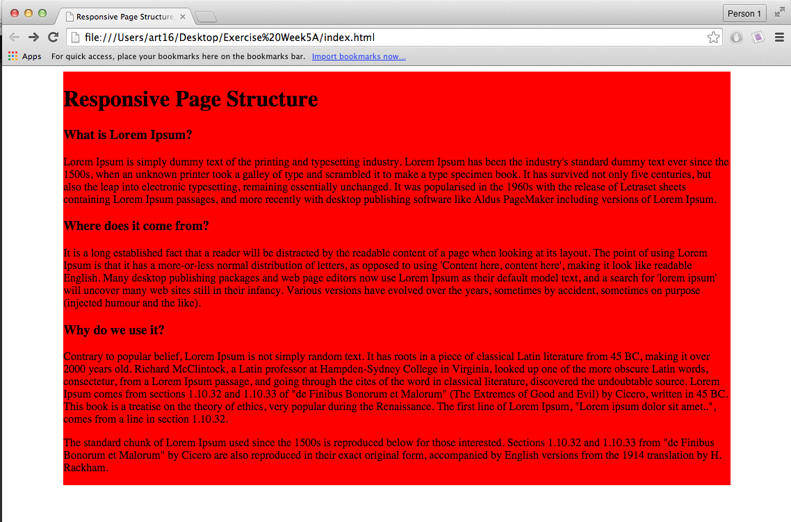
We had a bit of difficulty with our class exercise, especially with creating the responsive columns. we could create the columns, but they were not responsive. All that would happen is the text would be fluid and squish together to where there would only be two or three words per column. After having it reviewed, the problem was fixed but we still didn't understand what determined when the three columns were supposed to stack on top of each other in mobile mode. Also, I think that they should go to two columns in tablet mode since they seem a little long, and then to a single column in mobile.

 The following two screenshots were taken before the code was fixed by our professor. As you can see, we couldn't even get the three columns to work, even with the column one-third in it, as well as clearfix.


These are with the adjusted code, but we are still confused as to where the media query is that determines when the columns adjust their size.


Week 5: Adjusted Postcards


Week 5A: Feb. 16

Today in class we basically looked at each others' postcards and critiqued them. Since my classmates liked my postcard idea, all I am adjusting is the logo to the one that is on the Farm Show website, and adding several more similar-themed images for other post cards.

Week 4: Outside of Class

This weekend outside of class, I revised my visual style board, created a Webtype StyleGuide, a postcard based on what I plan on using on my website, and did the tracing paper div layout over my adjusted wireframes. As I was tracing over my wire frames, I was contemplating the idea to just have the split image of visitors/ exhibitors on the main part of the page instead of below the image slider. Why not make the split images as the image slider? That way if someone were to click on either half, the rest of the content as you scroll down on the home page would be oriented to that particular category of users.  I am still trying to figure out how the sub page will be fitted into the page as a parallax scroll, but I feel that this particular page can be useful to either category of users, so it will remain the same for both, unless I decide to make a few changes later on.

Visual Style Guide (revised):


Tracing Paper Wireframe Overlay:


Postcard:


Webtype Style Guide:


Wednesday, February 11, 2015

Week 4B

Today in class, we critiqued each others' visual style boards. Some suggestions for mine included:

  1. Add more family-oriented images
  2. A lot of images in website
  3. Clean typography, with a hint of a handwritten typeface, OR
  4. A typeface or two that better accommodates the farming theme
  5. Fix the color scheme (as I already assumed)
The rest of the class was in-class work time.

Homework:
  • Make adjustments to visual styleboard
  • Design visual syntax postcard(s)
    • full color: 3.5in L X 5in W
  • Create WebType Style Guide with Typecast (Google Fonts)
  • Create tracing overlay of div areas with markers 

Week 4: Wireframes/visual style guide

Here are my updated wireframes. As you can see, I am sticking with the idea of the photo slider taking up the entire opening of the page above the fold. I am going with a split screen idea below that, but am considering changing that to have that element on the opening of the page instead. This still opens up the idea of parallax scrolling. That way, say if I chose the visitor option, once I scrolled down the page, all of the content and links would be solely to meet the interest of a visitor to the Farm Show, and the same thing for exhibitors. With that in mind, the navigation bar would scroll down to the part of the website that you selected.  


With my styleboard, I had a bit of difficulty determining my color scheme, since I wanted to appeal to the different colors I think of when I imagine the colors of the ribbons and farm equipment at the farm show. However, I think I will have to narrow it down to 3 or 4, with light and dark versions of those colors.


Week 4A

Today in class, we critiqued each others' wireframe sketches in the middle room based on layout. For mine, it was suggested to explore a split-type of website to appeal to visitors to the Farm Show, or exhibitors. Since the website is very heavily riddled with links, I feel that this would be a great way to organize them, and only one set of links would be displayed at one time versus both exhibitors' and visitors' links jumbled together at once. Below is an example of a split screen. This gives me the idea to maybe continue with the parallax scrolling idea since the homepage would consist of one giant photo slider covering the entire page, with the rest of the information available as you scroll below.


Homework:
- Create a visual styleboard
- revise wireframes into one set

Week 3: Outside of Class

This weekend outside of class, I worked on my wireframe sketches for my website. I also read all of the assigned readings, and mostly took favor in the book, because the different styles of websites are very inspiring and help my to figure out what kinds of styles I would like to include in my own website.


Wireframes:

For these wireframes, I oriented my design toward a more modern approach to accommodate the theme, which is white space in this particular wireframe set. I still wanted to maintain photos in each layout, since I feel that imagery is important for the Farm Show website because it is a family and farmer-oriented event.


Here, I experimented a little bit with my layout. Since there are a lot of prize ribbons given out to competitive exhibitors, I kept that in mind while designing my navigation bar. My only problem here is the fact that I would run out of space in the mobile version, which could be solved by making it into a hide/reveal navigation bar in the mobile version. There would also be an image slider covering the entire page above the fold, which would mean that it would be a parallax scroll website.


Lastly, for these wireframes I still kept with the imagery since I feel that it is an important part of this website. I also utilized the hamburger icon once again to save space in the mobile and tablet versions. I am still not sure how the menu will appear yet, but I am thinking about some sort of vertical appearance, especially in the mobile version.


Friday, February 6, 2015

Week 3B

Today in class, we discussed the readings and our results from doing research over the weekend for our website re-design. Turns out I am not the only one who was not able to get in contact with someone, but I am still trying. We then reviewed different ways of coding a responsive website using media queries. Some of the different methods were confusing, but one method used seemed to make more sense on assigning what the arrangement of content should be on the page and what it should do at different sizes by distinguishing three sizes: desktop, tablet, and mobile. I now understand Media Queries, because before I only knew the name, not what it's purpose was.

Homework:

  • Web sketches: Using a content direction selected from the team exercise, create 3 different home pages and sub page with a lot of content (total of 6).
    • One direction with white space
    • One direction that reflects a Responsive Pattern
    • One direction experimental
  • Use Responsive Wireframe Sketch Sheet

Read: 


Wednesday, February 4, 2015

Week 2B

Day of Design:


In Class:

Today in class we looked at everyone's five websites that they have chosen as options to redesign. Of all four websites that I presented, it was decided that the Pennsylvania Farm Show is the best option, since it is a very popular event.

Homework:

  1. Review assigned event site
  • Call and ask:
    • Who uses the website and why?
    • What is the main reason for the site?
    • If you could change or add anything, what would it be?
  • Create persona for site redesogn (name, quote, age, occupation, location, behaviors, goals, actions)
  • Design Objectives for Website redesign 
    • Design objectives are similar to business objectives. With business objectives, you normally create a bulleted list of things that you want the website to achieve. With design objectives, your list includes messages and emotions you want to communicate. (Paul Boag)
  • Read Ch. 2- Flexible Grid

Week 2:Outside of Class

This week outside of class, I worked on my personas, design objectives, and am still trying to get ahold of somebody from the Farm Show. 

Personas


Design Objectives:

Messages:
  •        This website provides an easy to navigate resource for visitors and exhibitors at the Farm Show
  •        This is a website that tends equally to the needs of exhibitors and visitors
  •        Show times and schedule easily accessible
  •        Visitors can access the show map, and visitor guide
  •        Visitors and Exhibitors who are unfamiliar with the location of the Farm Show can find easy-to understand directions
  •       Exhibitors can quickly find information and enter the show


Emotion:

-       Warm and welcoming


I also read Chapter 2 in the Responsive Design PDF:

  • Typographic Grid:
    • A rational system of columns and rows in which modules of content could be placed
    • Concepts started by Modernists in mid-20th century
  • Showed example of a simple HTML/CSS markup for a headline
    • type sizes can be calculated by dividing target by context in order to get the result em (ex. 24px/16px= 1.5em)
    • this is better than setting the type size at 100% to accomodate with the browser's default type size, and is still resizable and scalable